EWS Embedded Web Services Portal
The Project
Design Goals
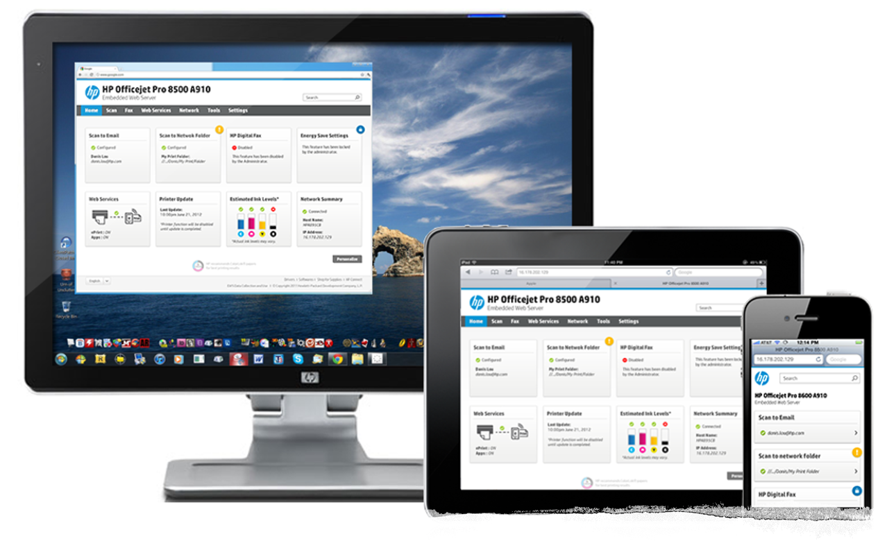
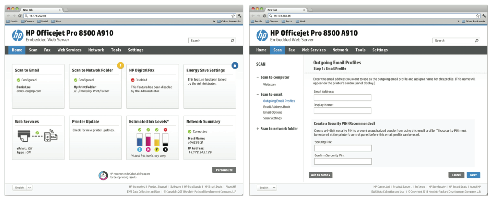
An application embedded into all HP printers (both ink and laser) that uses web technology to obtain status information and to configure printer settings. This tool can be opened by entering the IP of the printer in a web browser. To create EWS offering a unified experience across all HP printers. The EWS supports a flexible system, able to react to the user’s actions. It can detect the medium where it is currently being accessed, changing to provide the best experience possible to the user, both in terms of navigability and readability. The future of the EWS is not only desktop-based but is also optimized for tablets and smartphones.
My Role
As an Interaction Designer for this solution, I was responsible for designing EWS that behaves responsively, changing its appearance according to the device being used to access the EWS. This responsive behavior means that design elements, interaction behaviors and the user experience are consistent across all accessing devices. Synthesize field data and translate them into actionable insights and opportunities for creating compelling user experiences. Develop and manage project time-lines, building a design system with workflows, prototypes, wireframes and high fidelity visuals.
Deliverables
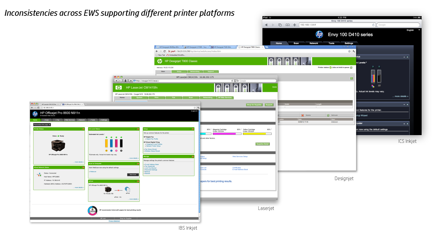
•Analysis - Identifying existing EWS design scopes of improvements
•Responsive Design Specifications
•Home Dashboard Tile Behavior and Interaction Task Flow
•Mobile EWS Specifications and Interaction
EWS Design Specification - Color Palette and Grid System
Analysis
RESPONSIVE DESIGN SPECIFICATIONS
The following will describe few essential guidelines adopted for this responsive design.
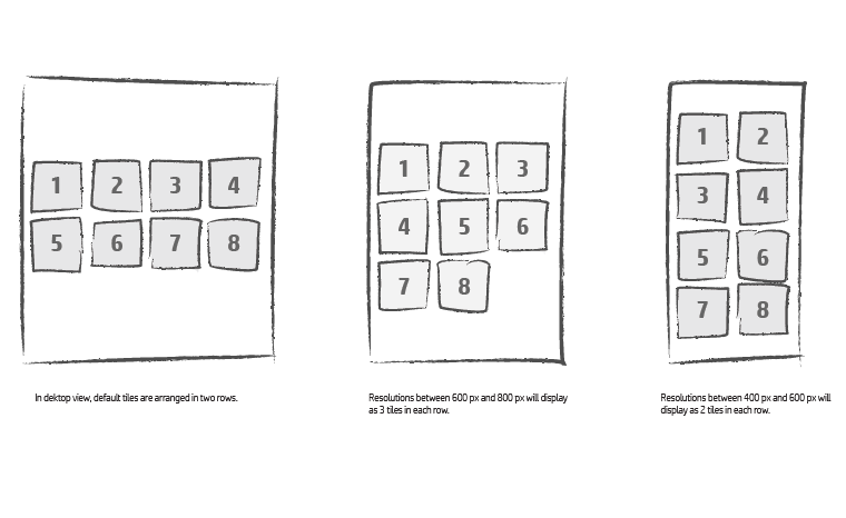
•Flexible grid layout
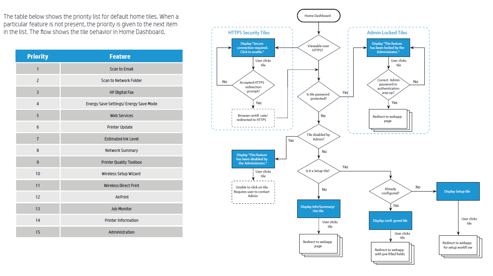
The following will describe the flexible grid and tile arrangement on the Home Dashboard page. As a standard rule of thumb, all home tiles are arranged from left to right and top to bottom. The Home Dashboard will display a minimum of 2 tiles in a row. It will not display any tiles when screen resolution is lower than the minimum 2 tiles.
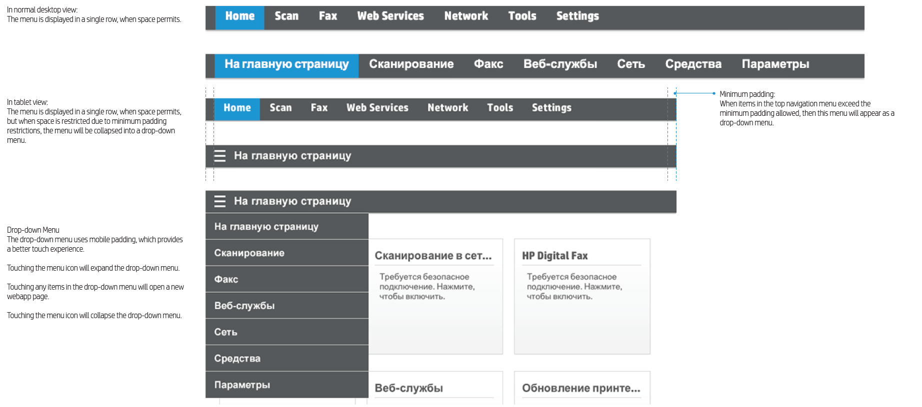
Responsive Navigation - Top Navigation Menu
The top menu will resize automatically from desktop to tablet view. In mobile view, the top menu will merge with the left navigation menu. The following will describe the navigation behavior in the EWS.
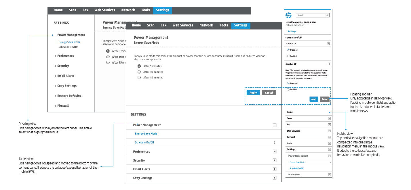
Responsive Navigation - Left Navigation Menu
The top menu and left navigation menu will resize automatically. The following will describe the left navigation behavior in the EWS
DASHBOARD EWS DESIGN OVERVIEW
The Desktop EWS design consists of a Home Dashboard view and a Configuration view. The following sections will define the Home Dashboard tiles and its interaction behaviors.
The home dashboard consists mainly of six different types of tiles, each of which is used to perform different actions. All these conditions are defined in its interaction flow on
the following page.
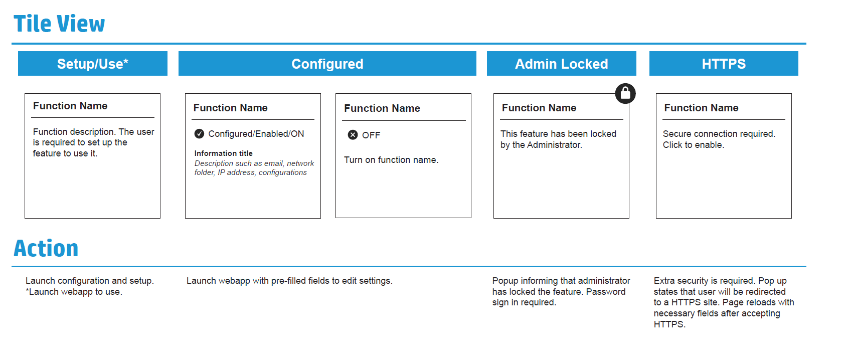
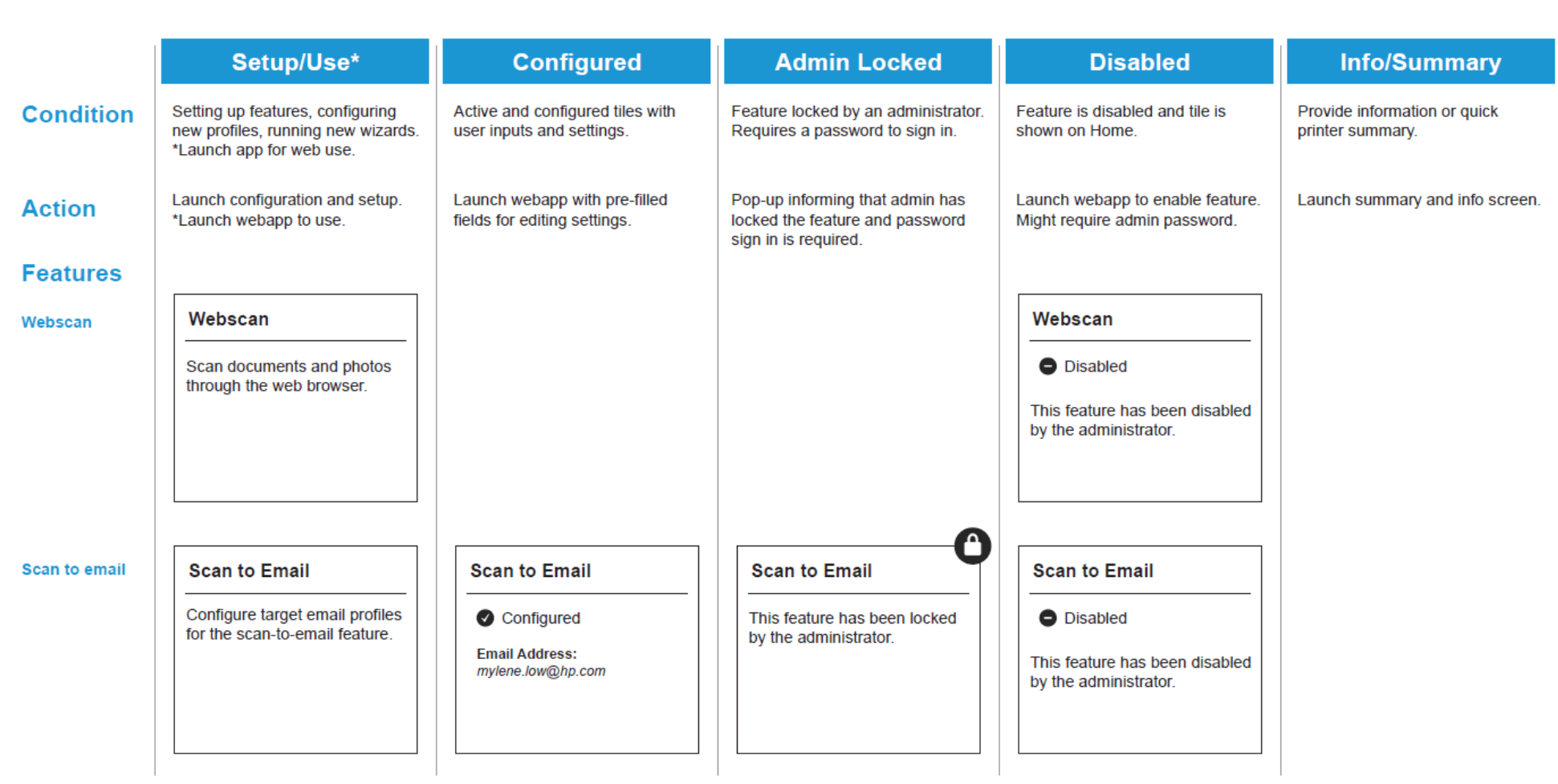
HOME DASHBOARD DEFAULT TILE BEHAVIOR & INTERACTION FLOW
Home Dashboard Tile Specification
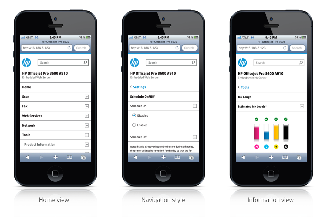
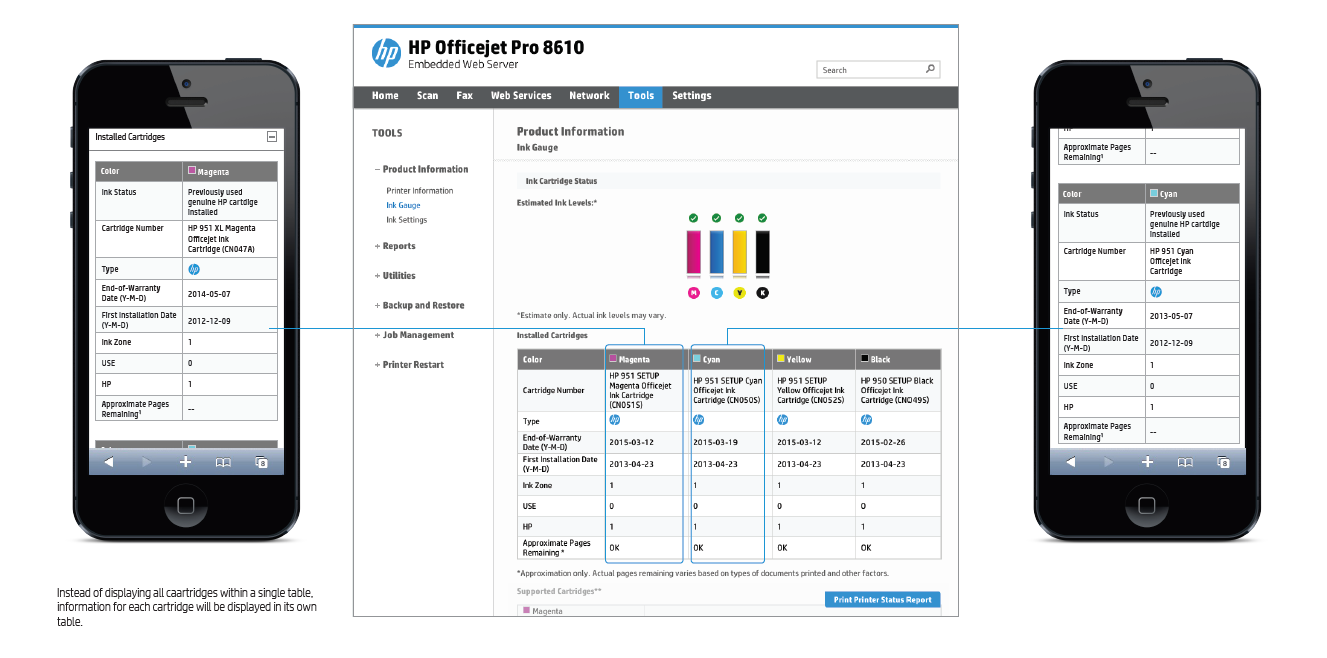
MOBILE EWS SPECIFICATION
Information-heavy tables must not be displayed in a liquid manner. Such tables will appear as multiple tables when in mobile view.
EWS DESIGN SPECIFICATION COLOR PALETTE AND GRID SYSTEM
Color Palette - Blue and grey are the primary accent colors in the HP web color palette.
The corresponding darker and lighter shades can be used to complement the primary colors when needed.

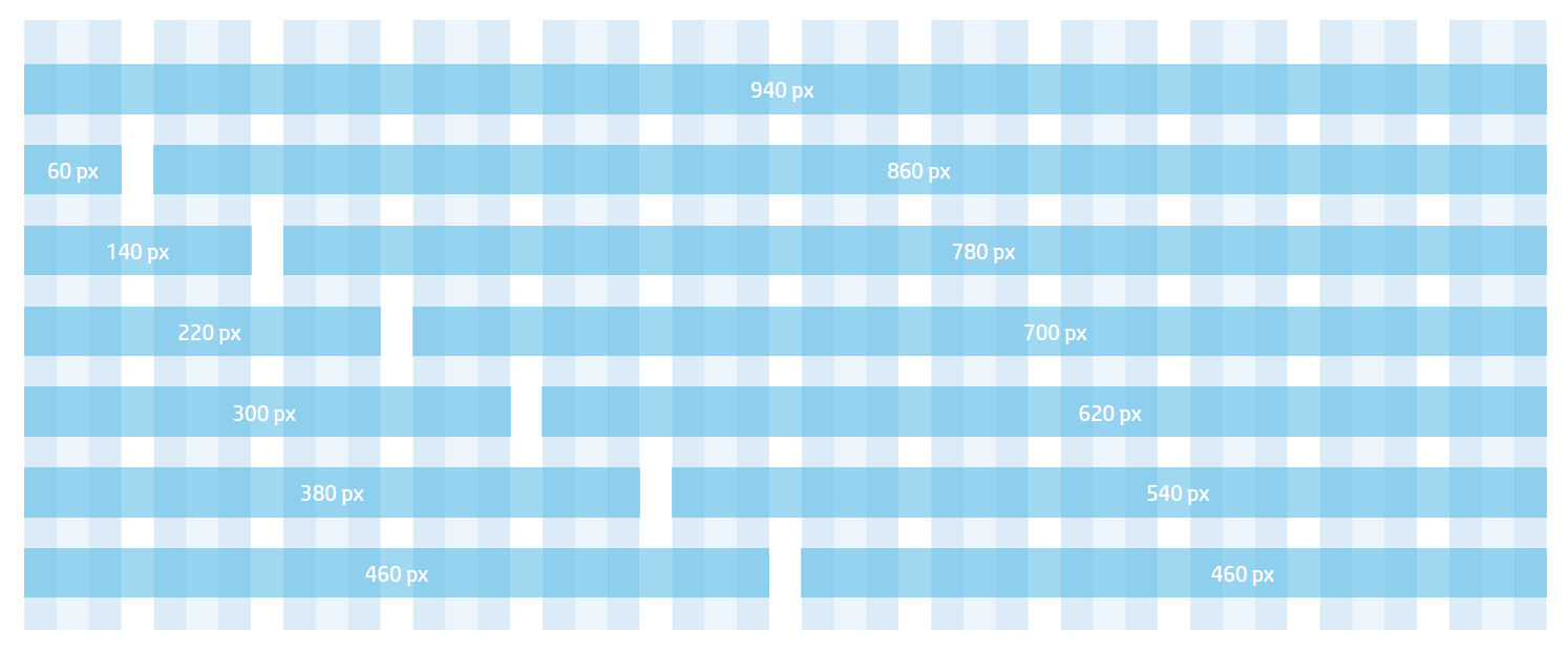
960 Grid System - The starting point is a universal 960-pixel divided into 12 columns. A 10 px margin is always placed at the right and left of the main content column. The narrowest column is 60 pixels wide. Each column after that increases by 80 pixels. (Available column widths are: 60, 140, 220, 300, 380, 460, 540, 620, 700, 780, 860 and 940.)